ChromatographyForge UI Documentation
Functional reference for each tab and panel in ChromatographyForge, illustrated with the application interface.
Prepared for ChromatographyForge | Last updated: August 19, 2026
Global Interface Panels
These controls are available across the application and support project-level workflows.
Global Panel
Header: Project Name, Status, and Project Action Buttons
What it is: The top application header with project identity and quick actions.
What it is used for: Creating a new project, saving/loading project state, downloading/uploading project files, and opening Recent Projects.
Example:
- Set a project name in the project name field.
- Click Save to Session after entering data.
- Use Download Project to export a portable `.hplc` project file.
Interface Screenshot
Shown: The full top header including project name, status text, and action icons.

Project identity, save status, project actions, and signed-in user.
Global Panel
Main Tab Navigation
What it is: The tab row with: Overview, Peaks Management, Conditions & Data, Report Generation, and Settings.
What it is used for: Switching between analysis, data entry, reporting, and configuration workflows.
Example:
- Process raw data in Overview.
- Open Peaks Management to refine peak properties and data points.
- Go to Report Generation to create a final report.
Interface Screenshot
Shown: The complete tab strip with the active tab highlighted.

Main navigation with the Overview tab active.
Overview Tab Panels
The Overview tab is the primary workspace for inputting conditions and reviewing predicted chromatography.
Overview - Left Panel
Quick Data Input
What it is: A multiline entry area for bulk data entry in this format: Peak Name, Condition Name, Condition Value, Retention Time.
What it is used for: Rapidly loading method-development data without adding points one by one.
Example:
- Paste lines such as
Peak1,Flow,1.0,5.2.
- Click
Process Data.
- Confirm success in the status message and continue to Initial/Target Conditions.
Interface Screenshot
Shown: The Quick Data Input box with sample lines and Process Data button visible.
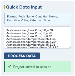
Bulk-entry format, example data, and Process Data action.
Overview - Left Panel
Initial Conditions
What it is: A generated list of baseline condition selectors (one selector per condition).
What it is used for: Defining the starting point used to calculate delta retention time and projected outcomes.
Example:
- For each condition (for example Flow or Temperature), choose the baseline value from the dropdown.
- Observe updates to predicted results and chromatogram.
Interface Screenshot
Shown: The Initial Conditions area with three condition dropdowns.
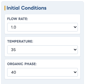
Baseline values for the three experimental conditions.
Overview - Middle Panel
Target Conditions
What it is: Numeric input fields for desired endpoint values for each condition.
What it is used for: Simulating how retention time shifts when moving from baseline to target method values.
Example:
- Enter a target value for each condition.
- Wait for automatic recalculation.
- Review updated retention time table and predicted chromatogram shape.
Interface Screenshot
Shown: The Target Conditions group with edited values.

Target values used for the illustrated prediction.
Overview - Middle Panel
Predicted Chromatography
What it is: The chromatogram visualization canvas plus controls for range, scale, and view mode.
What it is used for: Visual comparison of predicted peak positions and potential separations.
Example:
- Set View to
Zoom Peaks to focus around elution zones.
- Increase Scale to emphasize peak separation.
- Switch between
Overlay and Compare and toggle Initial.
Interface Screenshot
Shown: The full Predicted Chromatography panel including controls, chart, and legend.
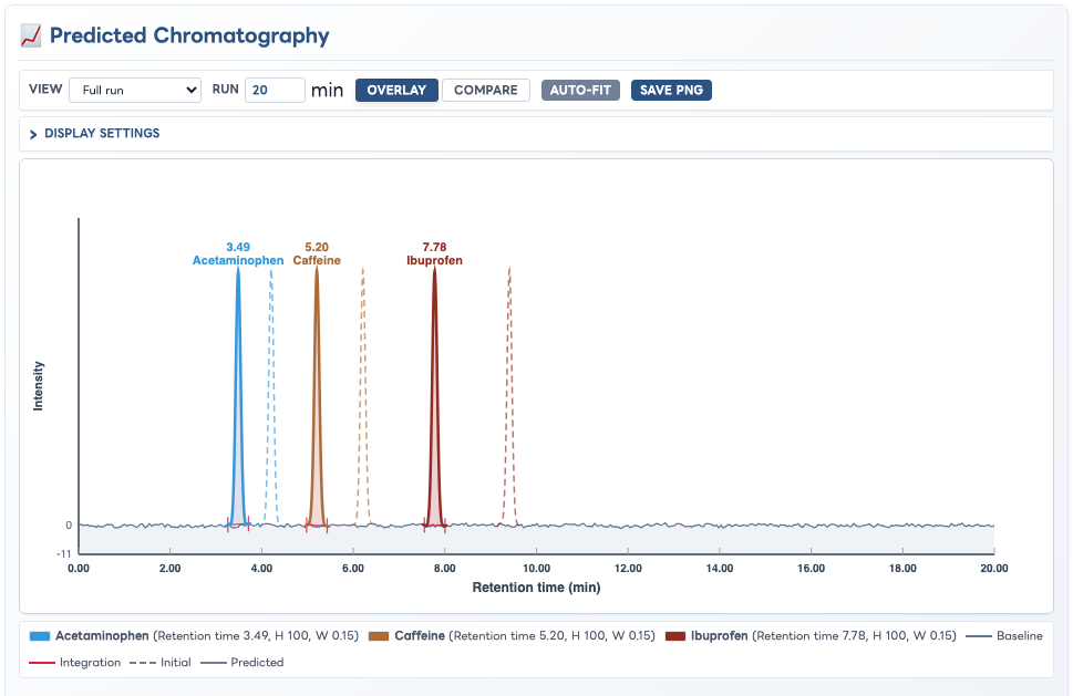
Predicted and initial retention positions for the three example analytes.
Overview - Display Settings
Display Settings: Practical Effects
What it is: The expandable Display Settings area controls Y-axis scale, initial and predicted peak visibility, peak fill, width scaling, separate or merged rendering, baseline offset, noise, and integration markings.
What it is used for: Adapting the chromatogram presentation for visual inspection, comparison, integration review, and export.
Important: These controls change the visualization only; they do not alter the regression models or predicted retention times. The merged example temporarily uses a peak width of 0.42 minutes so its component and valley behaviour is easy to see.
Expanded Display Settings
Shown: All Display Settings controls alongside the chromatogram they affect.
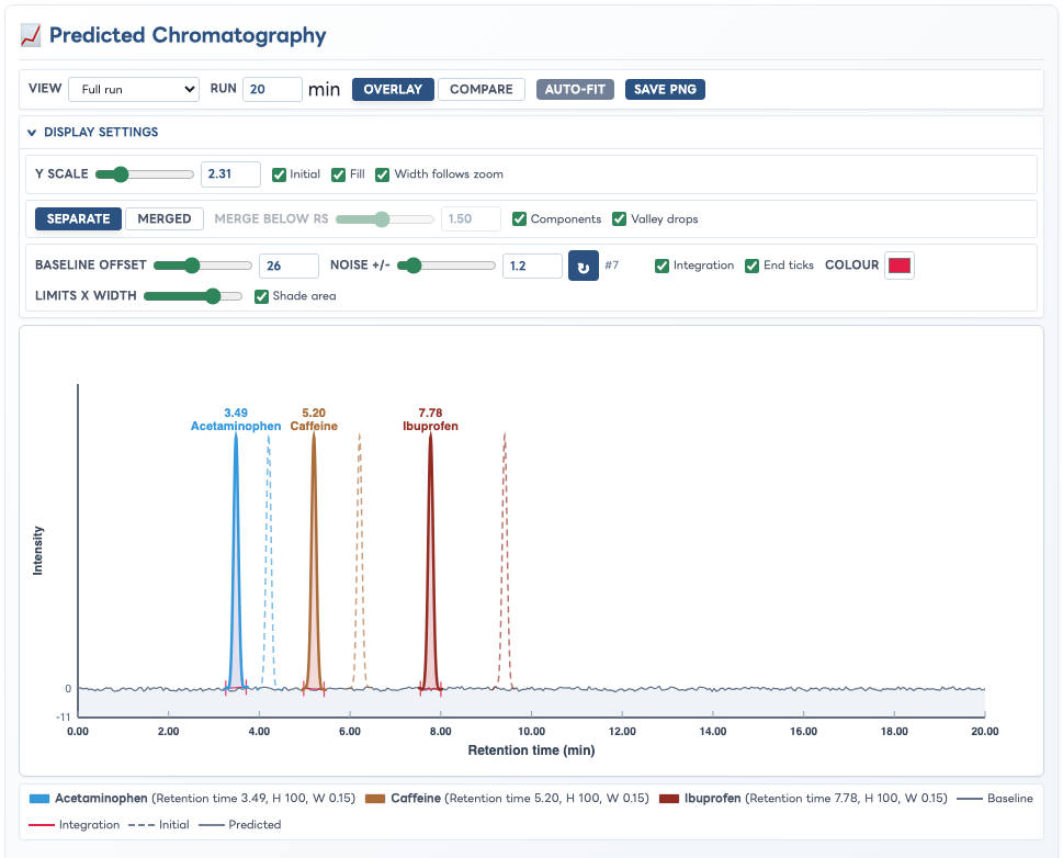
Open Display Settings to access the three control rows without leaving the Overview workspace.
Clean Predicted-Only Trace
Settings employed: Y scale 1.00; Initial, Fill, Integration, End ticks, and Shade area off; Baseline offset 0; Noise 0.0.
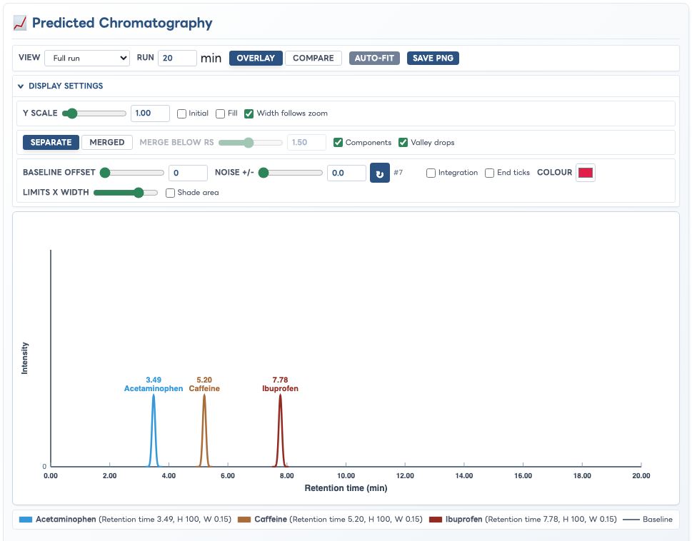
A simplified trace isolates predicted peak position and shape.
Enhanced Analytical Trace
Settings employed: Y scale 1.80; Initial and Fill on; Baseline offset 36; Noise 3.5; Integration, End ticks, and Shade area on.

The same prediction with initial-position comparison, amplified peaks, a realistic baseline, and integration limits.
Merged Broad-Peak Trace
Settings employed: Merged rendering; merge threshold 3.00; Components and Valley drops on; Initial off; Fill and Integration on.

Merged mode draws the combined envelope while retaining component and valley information for overlapping or broad peaks.
Overview - Right Panel
Retention Time Results and Resolution
What it is: Tabular prediction output with optional detailed columns, plus pairwise resolution metrics.
What it is used for: Quantitatively checking predicted retention changes and separation quality.
Example:
- Enable
Details to show condition-by-condition contribution.
- Compare Initial Retention Time vs Predicted Retention Time.
- Review the Resolution section to identify weak peak separation.
Interface Screenshot
Shown: The retention time table and Resolution list in one view.
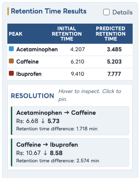
Predicted retention times and pairwise separation quality.
Peaks Management Tab Panels
This tab controls per-peak configuration, data quality checks, and manual edits.
Peaks Management
Tab Controls: Show Details and Add Peak
What it is: Top controls that toggle detailed peak content and create a new peak card.
What it is used for: Managing tab density and extending the model with new analyte peaks.
Example:
- Click
+ Add Peak and enter a peak name.
- Use
Show Details to collapse or expand table-heavy sections.
Interface Screenshot
Shown: The tab header controls with populated peak cards below.

Peak-management controls with populated cards immediately below.
Peaks Management
Peak Card
What it is: A per-peak container including name, color indicator, peak property inputs, regression quality, and editable data tables.
What it is used for: Fine control over model behavior and cleanup of peak-specific calibration data.
Example:
- Adjust Peak Height or Peak Width (sigma) to tune simulated peak shape.
- Edit condition value and retention time values directly in the table.
- Delete incorrect data points or add new points to improve regression fit.
Interface Screenshot
Shown: A complete peak card from its header through the editable tables.
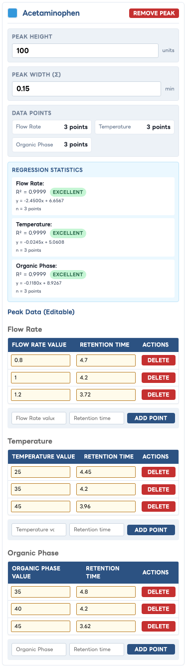
A complete peak record, including all three condition datasets.
Peaks Management - Modal
Peak Color Picker
What it is: A pop-up dialog opened by clicking a peak color indicator.
What it is used for: Assigning fixed, readable peak colors for charts and legends.
Example:
- Click the colored dot next to the peak name.
- Choose a predefined color or use the custom color picker.
- Confirm the chromatogram and legends update accordingly.
Interface Screenshot
Shown: The color picker dialog with color tiles and custom color input.

Preset palette and custom colour selection for Acetaminophen.
Conditions & Data Tab Panels
This tab supports condition-centric analysis and controlled data point entry for model training.
Conditions & Data
Conditions Header and Add Condition
What it is: The tab heading with an + Add Condition action.
What it is used for: Adding a new independent variable (for example pH, flow rate, or temperature).
Example:
- Click
+ Add Condition.
- Provide condition name and baseline value in prompts.
- Review new nested condition tab and generated inputs in Overview.
Interface Screenshot
Shown: The Conditions & Data header with the Add Condition button visible.

Condition-management heading and add action.
Conditions & Data
Quick Multi-Condition Entry
What it is: A guided bulk-entry panel for adding retention time points while enforcing single-variable experiment logic.
What it is used for: Fast acquisition of baseline and single-condition perturbation data.
Example:
- Select a Peak and enter Retention Time.
- Leave all conditions at default to record a baseline point.
- Change only one condition to add a single-variable experiment point.
Interface Screenshot
Shown: The full Quick Multi-Condition Entry panel including status text and Add Data Point button.
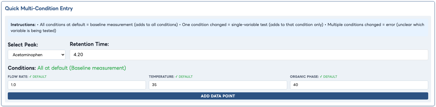
Guided baseline and single-variable data entry.
Conditions & Data
Nested Condition Tabs
What it is: A secondary tab row where each condition has its own analysis panel.
What it is used for: Switching between condition-specific regression and data-point views.
Example:
- Click condition tabs (for example Flow, Temperature).
- Observe each tab refresh its condition-specific graph and point lists.
Interface Screenshot
Shown: The nested condition tabs and active tab state.

Condition-specific navigation with Flow Rate active.
Conditions & Data - Condition Detail
Linear Regression Plot, Data Points, and Add Data Point Form
What it is: The condition detail panel combining a regression chart, current data-point list, and manual data-entry form.
What it is used for: Evaluating model fit quality and adding/removing supporting data for each condition.
Example:
- Inspect the plotted points and regression lines for each peak.
- Use the Data Points list to remove outliers.
- Add a new point using Peak, Condition Value, and Retention Time fields.
Interface Screenshot
Shown: The full condition detail area including chart, legend, list, and add form.
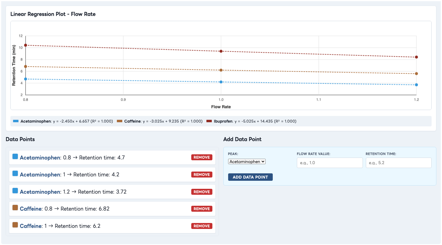
Condition model, regression legend, current observations, and manual-entry form.
Report Generation Tab Panels
This tab assembles a formal method-development report with configurable content sections.
Report Generation
Report Header Actions
What it is: Action buttons for resetting fields, generating report output, printing, and downloading PDF.
What it is used for: Running and exporting reporting workflows with one-click actions.
Example:
- Click
Reset to Defaults to start from standard settings.
- Complete report fields and options.
- Click
Generate Report, then use Print Report or Download PDF.
Interface Screenshot
Shown: The top action bar with all report buttons visible.

Report workflow actions after a preview has been generated.
Report Generation
Report Information Panel
What it is: Form fields for title, analyst, department, project ID, method description, and comments.
What it is used for: Capturing metadata and narrative context for report consumers and compliance records.
Example:
- Set a report title and analyst identity.
- Enter project ID using the configured prefix.
- Add concise method notes and comments for final review.
Interface Screenshot
Shown: The completed form from Report Title through Additional Comments.
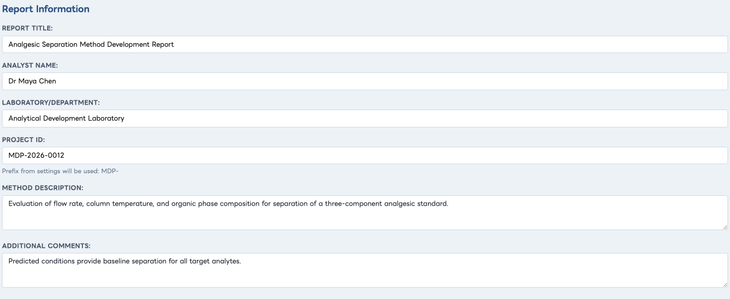
Illustrative report metadata and method-development narrative.
Report Generation
Include in Report Options
What it is: Checkboxes to include Target Conditions, Chromatogram, Elution Order, Resolution, Statistics, Method Development, and Raw Data.
What it is used for: Tailoring report depth for audience, review stage, or regulatory need.
Example:
- Keep core sections enabled for routine reporting.
- Enable Raw Data and Regression Statistics for technical review packages.
Interface Screenshot
Shown: All "Include in Report" checkboxes in one image.

Content controls for tailoring the generated report.
Report Generation
Method Development Options Panel
What it is: Controls for variation percentages and experimental design (full vs reduced runs), with preview area.
What it is used for: Generating practical experimental plans around target conditions.
Example:
- Select plus/minus variation magnitudes (for example +/-10% and +/-20%).
- Choose Full design for complete coverage or Reduced runs for faster screening.
- Review generated design summary in preview and final report output.
Interface Screenshot
Shown: The variation controls, run-type selection, and preview block.
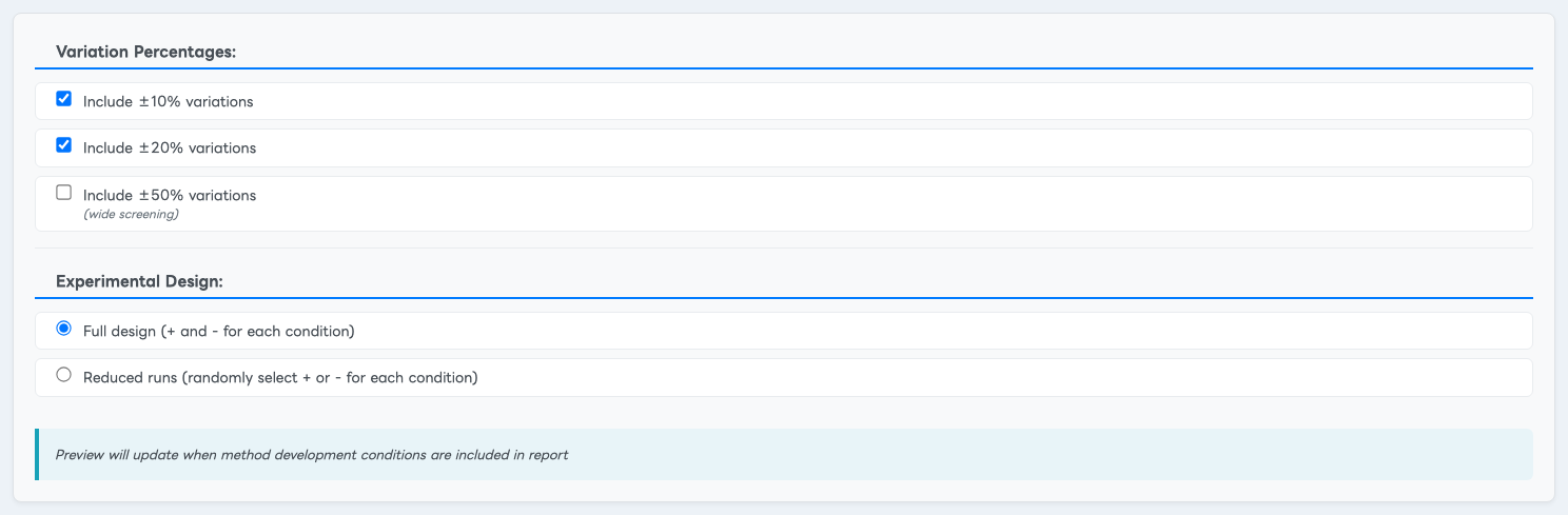
Variation levels and full experimental design preview.
Report Generation
Report Preview Panel
What it is: The generated report canvas shown after clicking Generate Report.
What it is used for: Final content validation before print or PDF export.
Example:
- Generate report.
- Inspect core sections (conditions table, chromatogram, elution order).
- Validate optional sections (resolution, regression models, raw data, method development) based on selected checkboxes.
Interface Screenshot
Shown: The first full page of generated preview content.
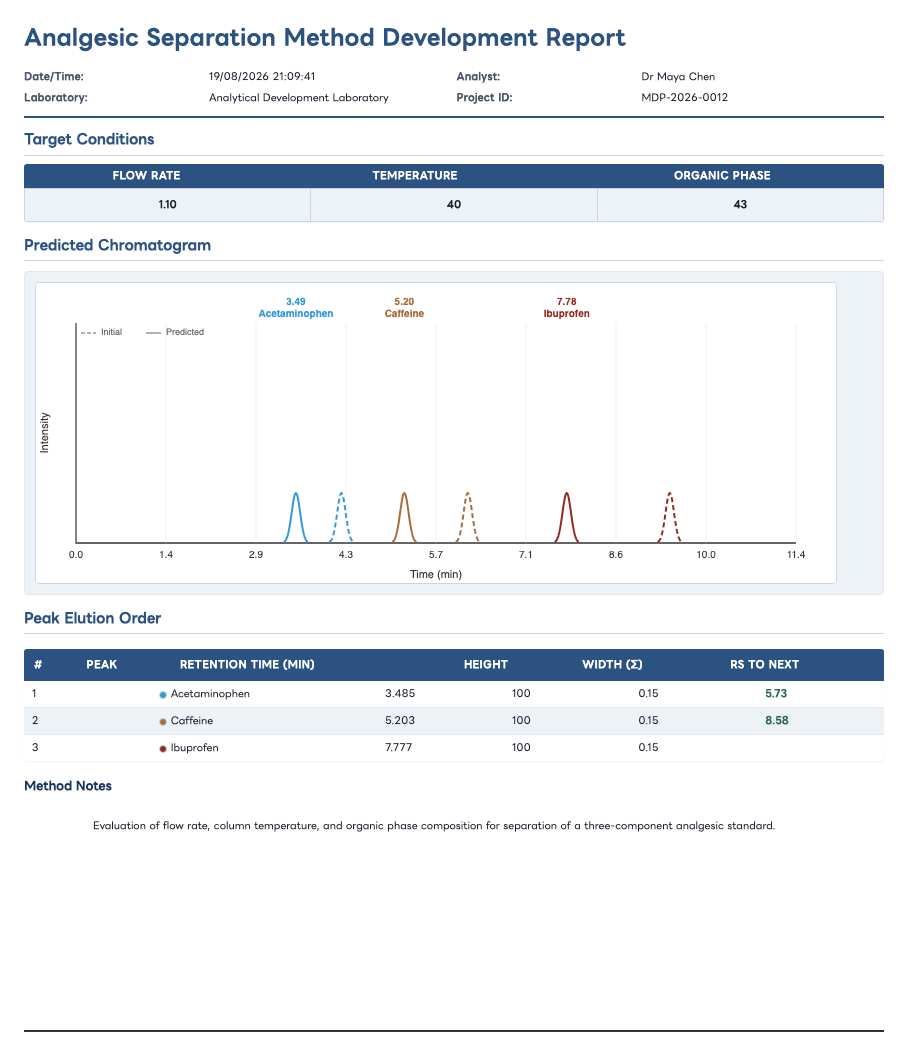
First page of the generated report for the illustrated project.
Settings Tab Panels
This tab controls persistent app behavior, report defaults, organization identity, and compliance metadata.
Settings
Settings Action Bar
What it is: Save and file-transfer controls for settings, plus reset-to-default action.
What it is used for: Maintaining reusable configuration across sessions and users.
Example:
- Modify settings values.
- Click
Save Settings to persist in browser storage.
- Use
Save to File to distribute a controlled configuration baseline.
Interface Screenshot
Shown: All settings action buttons in one view.

Settings persistence, file-transfer, template, and reset actions.
Settings Category
Settings File Management
What it is: Explanatory panel describing JSON settings import/export behavior.
What it is used for: Communicating file format expectations and sharing workflow.
Example:
- Download a template file.
- Edit values externally when required.
- Load the file into another ChromatographyForge environment.
Interface Screenshot
Shown: The full Settings File Management section.
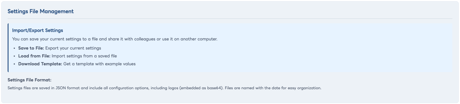
Import/export guidance and the documented JSON file format.
Settings Category
Company/Laboratory Information
What it is: Inputs for logo upload, organization name, department, and address.
What it is used for: Branding and organization metadata in generated reports.
Example:
- Upload a lab logo.
- Set organization name and department defaults.
- Save settings and regenerate a report to verify branding output.
Interface Screenshot
Shown: The logo upload controls and company identity fields.

Branding controls and illustrative laboratory identity values.
Settings Category
Default Report Information
What it is: Default analyst, lab department, project prefix, and standard method notes.
What it is used for: Pre-populating report fields for consistent output and faster report setup.
Example:
- Set Project Prefix to a controlled format (for example MDP-2026-0012).
- Add standard method notes for routine reporting.
- Generate a report to confirm defaults are applied.
Interface Screenshot
Shown: The populated fields in the Default Report Information section.
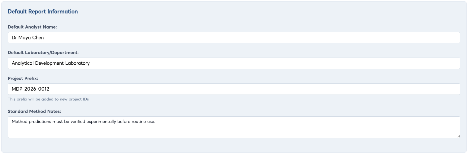
Reusable report metadata for the fictional analytical laboratory.
Settings Category
Report Defaults
What it is: Checkbox defaults that mirror report content toggles in the Report Generation tab.
What it is used for: Ensuring predictable report composition for common use cases.
Example:
- Enable sections required for your SOP template.
- Disable optional sections not needed in routine runs.
- Save settings and use Reset to Defaults in Report Generation to validate behavior.
Interface Screenshot
Shown: All report default checkboxes.

Default inclusion state for each generated report section.
Settings Category
GMP Compliance Settings
What it is: Inputs for regulatory standard, SOP reference, and quality system reference.
What it is used for: Including compliance metadata in generated reports for quality and audit traceability.
Example:
- Select a regulatory profile (for example FDA 21 CFR Part 11 or ICH Q2(R1)).
- Add SOP and quality system references.
- Generate report and verify metadata appears in report header fields.
Interface Screenshot
Shown: The GMP compliance fields in one image.
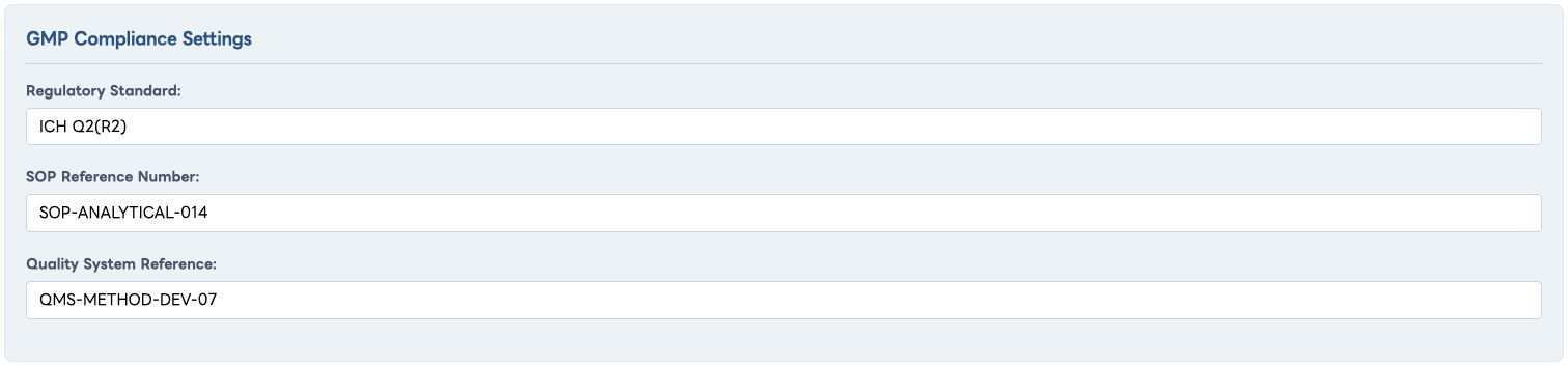
Illustrative regulatory standard, SOP, and quality-system references.
Settings Category (Dynamic)
User Account Information
What it is: A dynamic settings section inserted for authenticated users (name, username, email, license details, and account actions).
What it is used for: User identity confirmation and account/license management actions from within the app.
Example:
- Open Settings after sign-in.
- Review license type and seat usage.
- Use license action buttons if available for your role.
Interface Screenshot
Shown: The full User Account Information section for a fictional user.

Fictional user identity, seat usage, and account/license actions.
Supporting Dialog Panels
These are modal overlays used for account access, project recall, and license workflows.
Modal
Recent Projects
What it is: A dialog listing up to 10 recent projects with load and delete controls.
What it is used for: Quickly restoring earlier projects without manual file browsing.
Interface Screenshot
Shown: The Recent Projects dialog with date/time metadata.
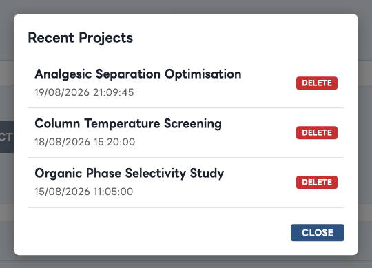
Three illustrative saved projects with load and delete affordances.
Modal
Authentication Modal: Sign In, Create Account, Reset Password
What it is: The access gate shown for unauthenticated sessions with three auth tabs.
What it is used for: User login, demo account creation, and password reset operations.
Interface Screenshot
Shown: The default Sign In view with Create Account and Reset Password available as tabs.

Default sign-in state with all three authentication workflows visible as tabs.
Modal
Demo Upgrade Prompt and Upgrade Options
What it is: Demo-mode overlays describing feature differences and paid license options.
What it is used for: Guiding users from limited demo workflows to full licensed capabilities.
Interface Screenshot
Shown: The demo comparison card and primary upgrade call-to-action.
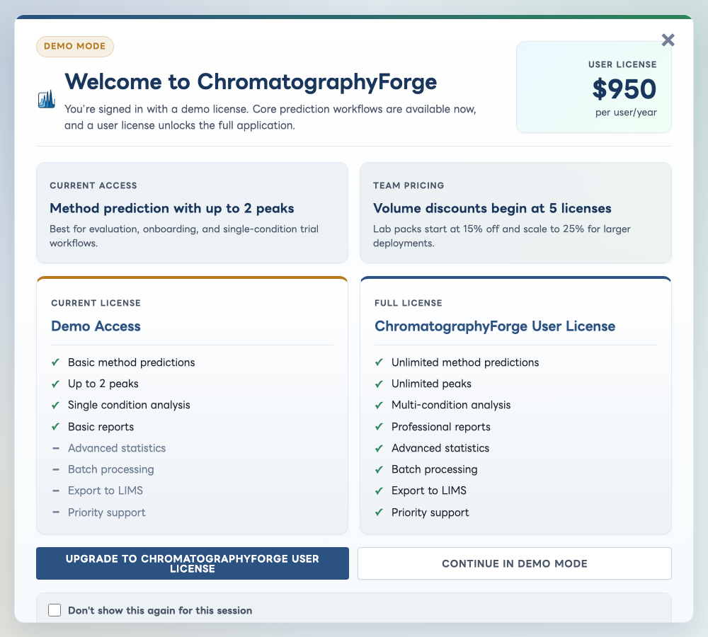
Demo and full-license comparison with upgrade and continue actions.